Project Overview: Austin Childcare Connection
Austin Childcare Connection is a company dedicated to connecting nannies and parents in the Greater Austin area of Texas. The platform allows parents to post childcare job listings and find nannies, while caregivers can seek employment opportunities and access valuable childcare resources. It ensures that childcare providers and families meet industry standards for employment.
Tools
Figma, Canva, Asana, Google Work
Time
3 Weeks
Role
UX Designer | UX Research Lead
Project
Client Team Project
Challenge of the Project
Finding Skilled and Reliable Childcare: Parents often struggle to find caregivers with the right experience and trustworthiness.
Building Trust and Transparency: The childcare industry requires a high level of trust, often lacking in existing platforms.
Complex Competitor Designs: Many competitor websites have complex and unethical designs, which make it hard for users to unsubscribe or find appropriate matches.
Our Solutions
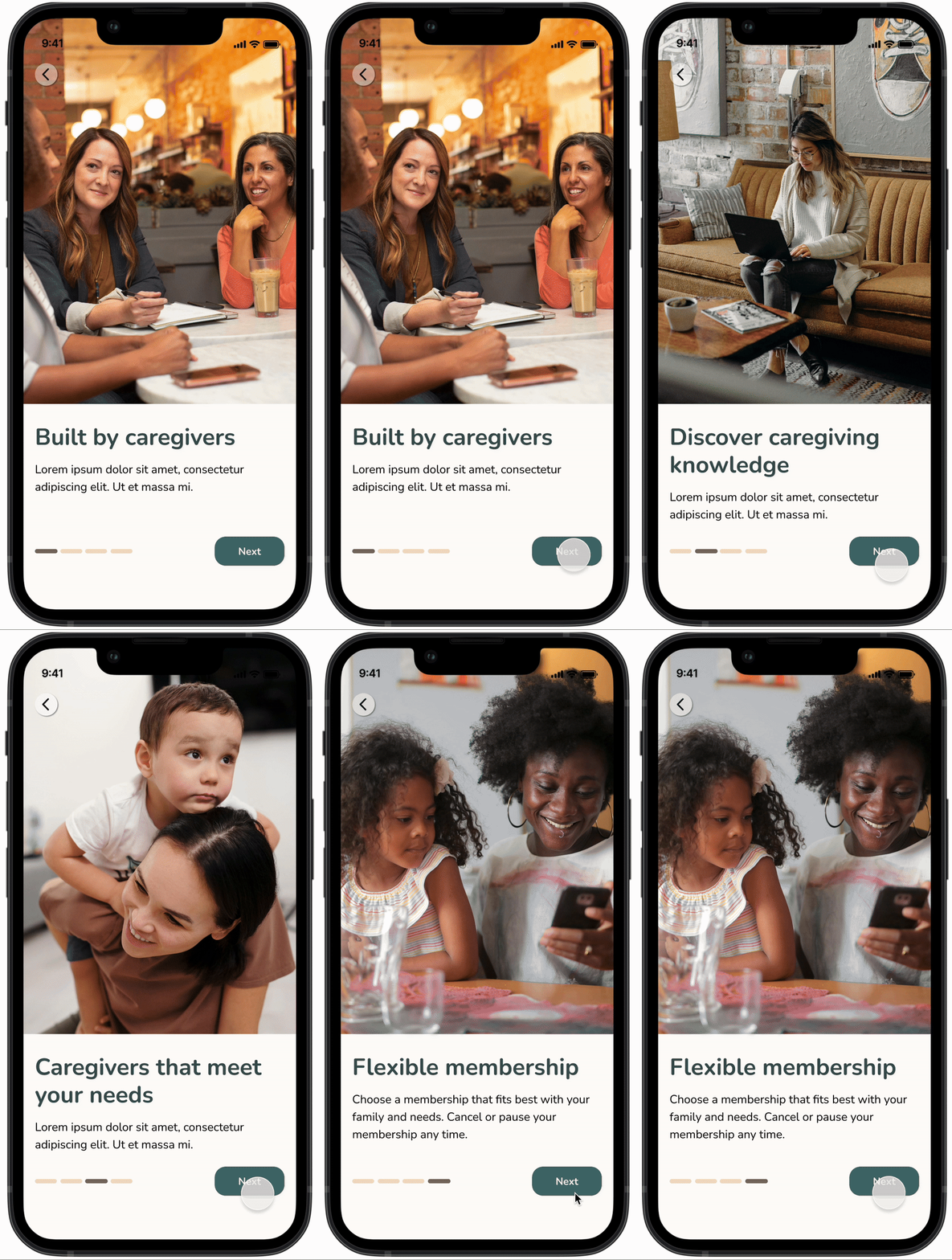
Informative Onboarding Tour
Designed to provide a user-friendly onboarding experience, enhancing engagement and overall satisfaction.
Introduces users to the services offered by the company.
Establishes transparency and trust before users commit to a membership.
Keeps users informed about what to expect during account creation and job posting.
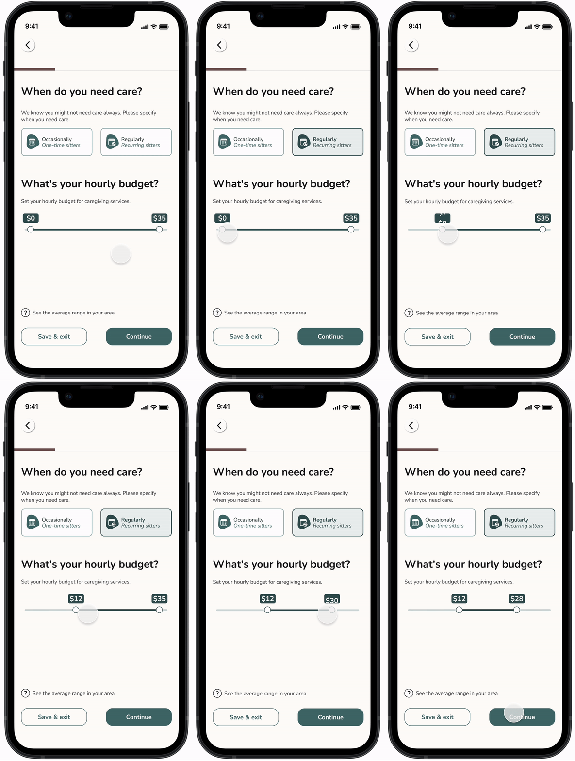
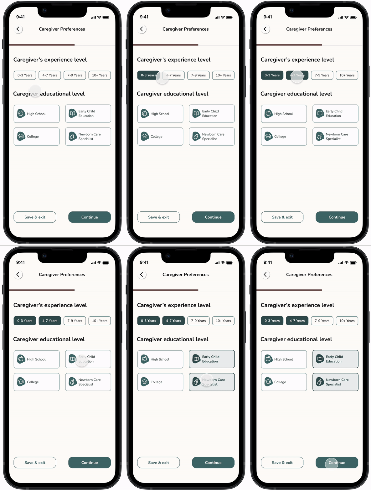
Onboarding Questions
Asking questions during onboarding to make the experience to individual needs, improving user satisfaction and matching accuracy.
Allows to save users’ progress during account creation and job posting, enhancing convenience and user experience.
Transparent Matching System
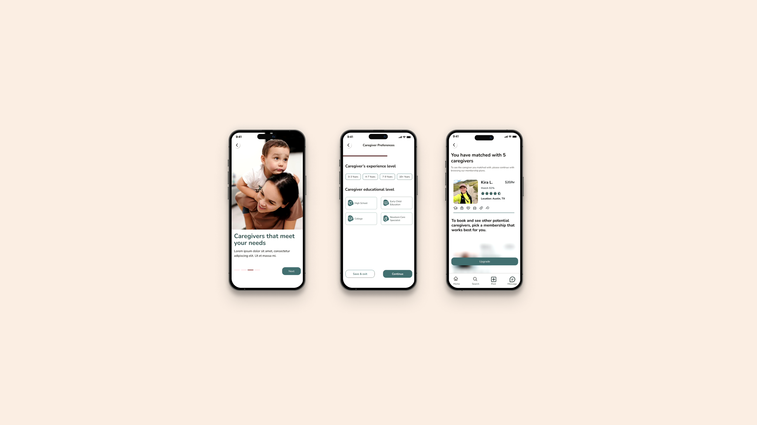
Users can see the criteria a potential caregiver meets through displayed badges.
Provides clear instructions on what each membership includes.
Includes reviews to build trust among users.
Shows which criteria the caregiver meets and the matching percentage with parents' preferences.
Business Needs
Enable users to make confident decisions by the end of their session.
Create a welcoming and inclusive experience for parents.
Ensured that accessibility considerations were integrated into the iOS application.
According to the heuristic evaluation, the current website requires additional visual elements and needs to address color accessibility issues.
Task Anaysis
Analyzed the tasks of 6 leading companies to identify key industry-standard features and elements. The focus was on understanding how the sign-up process and app navigation are handled. This helped us recognize clear and effective practices that can be applied to ensure a user-friendly experience. According to our research, we identified several key points.
Onboarding: A detailed onboarding process can improve match quality; but may also overwhelm users. Finding the right balance is essential for a smooth user experience.
Personalization: Users greatly appreciate personalized experiences and recommendations, but keeping these features simple is important to avoid complicating the user experience.
Matching: Users expect to easily and quickly connect with caregivers who best match the features they have selected.
Signup Phase: Interactive and engaging elements in both the onboarding and signup processes are designed to enhance the user experience. On the other hand, provided they don't overshadow essential information.
User Interviews
To understand the diverse needs of parents using childcare services, we conducted interviews with six parents, including queer parents, fathers, and mothers from California, Texas, and Colorado. This approach ensured diversity in our user base and helped us understand the unique challenges and requirements of different parenting roles and family structures. Our interviews revealed that parents want caregivers to possess specific skills and services tailored to their family's needs. Many parents face difficulties when searching for reliable childcare services. They appreciate apps and websites that are memorable and welcoming, with user-friendly interfaces and features. The frequency of using childcare services varies among parents, highlighting the need for flexible and accessible options.
Significant Interview Questions:
How often do you use childcare services?
What skills and services do you want your caregivers to have?
Have you encountered any challenges when searching for childcare services?
What features make your favorite app or website memorable and welcoming?
** Quotes taken from research interviews
Interview Insights:
After conducting user interviews, as the research lead, I closely reviewed all the interviews and took notes to ensure no important details were overlooked. I then created a detailed affinity map highlighting these key insights, and we finalized it together with the team. We identified several key trends:
Experience Level: Users prioritize caregivers with substantial caregiving experience, recognizing that their needs for short-term and long-term care differ.
Language: Parents who speak more than one language prefer caregivers if they can speak their language.
Safety Concerns: Safety is a top priority, with users wanting caregivers to undergo background checks and hold certifications such as First Aid and CPR.
Reviews and Referrals: Users value reviews and referrals highly, seeking to gather as much information as possible about a caregiver before hiring.
Availability: The ability to find care on a full-time, part-time, and last-minute basis is crucial for users.
Trustworthy: Users want to see a transparent platform in both the membership process and caregiver reviews.
Meet with Persona: Monica
According to our user research, we observed that despite maintaining a diverse demographic, the processes and expectations of parents searching for caregivers intersected at many points. Based on these observations, we created a persona aligning the business goals and the parents’ needs.
Monica is a working mother who is frustrated when trying to find a caregiver who best matches her and her daughter’s criteria. She needs to find an ethical and transparent platform along with a caregiver who is experienced in childcare, prioritizes safety, and is reliable.
Brainstorming: How Might We
After our group brainstorming sessions, we decided that the "matching process" would be the central focus point of our design. Our goal was to enhance the onboarding experience by categorizing it clearly and smoothly through onboarding questions. In addition to this, we implemented an onboarding tour to inform users about the company before they sign up for membership and to provide an overview of the onboarding process before they proceed further.
How might we ensure caregivers have verified and sufficient childcare experience?
How might we instill trust in parents while they sign up for our service?
How might we give parents options to select caregivers who are proficient in specific languages?
How might we prioritize and address child safety concerns during the parent onboarding process?
Designing the Parent Experience
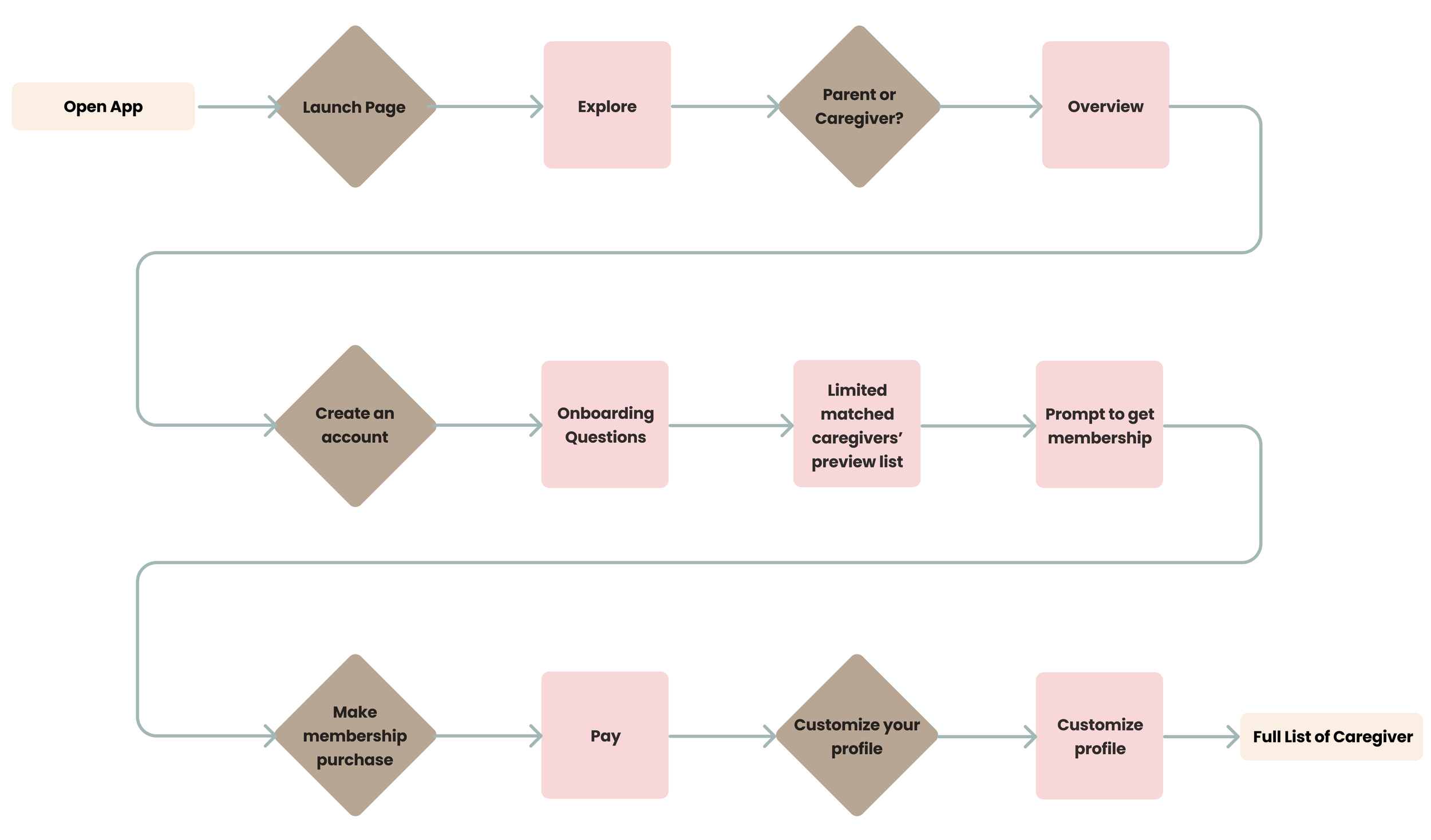
The user flow guides parents through an efficient and smooth journey to find a caregiver. It begins with account creation, where parents receive clear instructions at each step. The onboarding process includes answering key questions to personalize caregiver matches to the family’s needs. As they move forward, parents are introduced to membership options that unlock a curated list of caregivers having their criteria. The entire journey is designed to be intuitive and user-friendly, allowing parents to quickly and confidently connect with the right caregivers.
Happy Path of the User Flow. Click here to explore all the details of the extended user flow
Visualizing Ideas
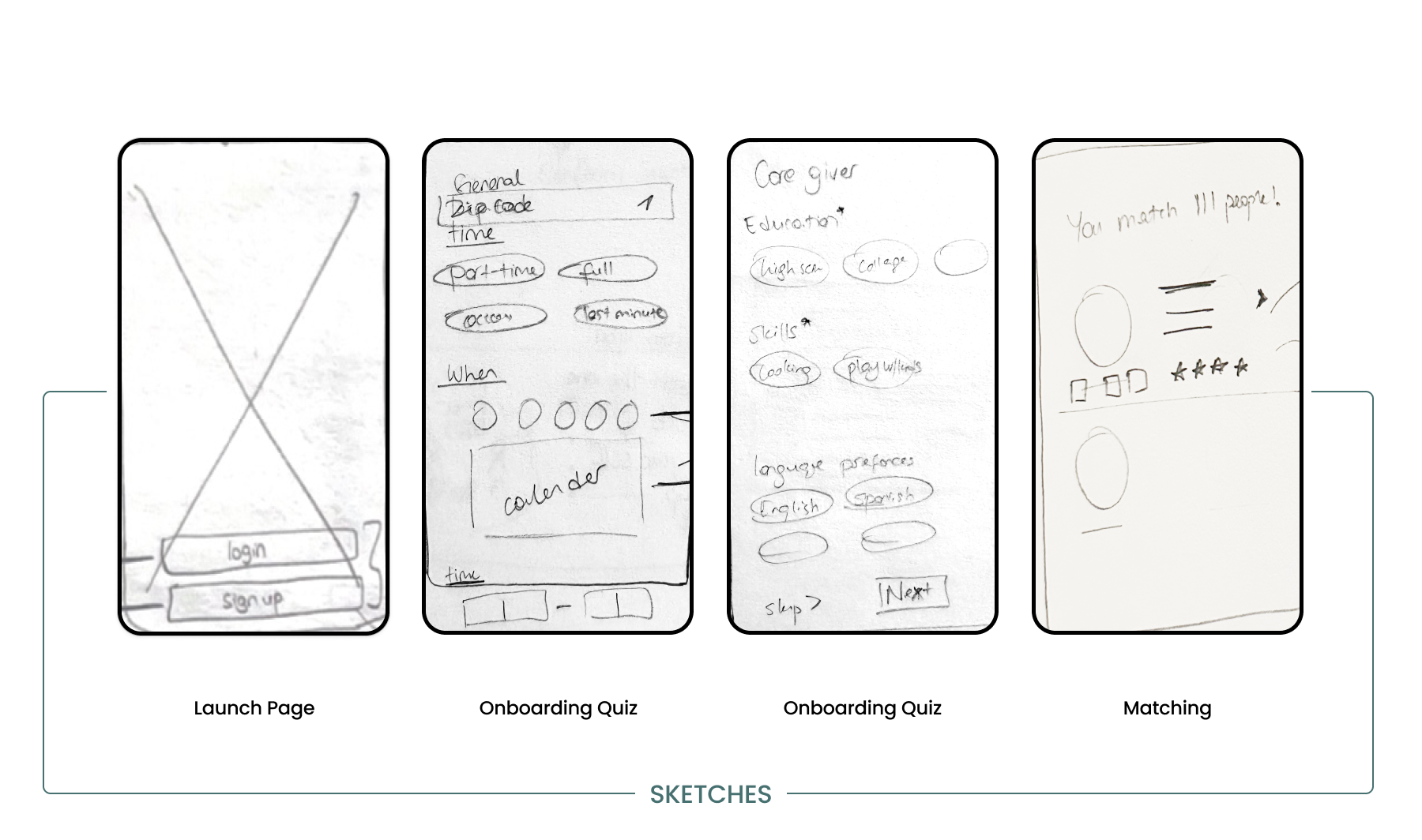
After creating the user flow, we determined the key screens to design. We conducted several design studios as a group to brainstorm how to bring these ideas to life. The biggest challenge at this stage was maximizing user experience without overwhelming them with too many questions. After meetings with the client, we concentrated our designs on three main categories:
Lunching Screens
Onboarding Questions
Membership Options
Sketches were drawn by me during our design studio time. Click here to explore all sketches
Building the Digital Skeleton
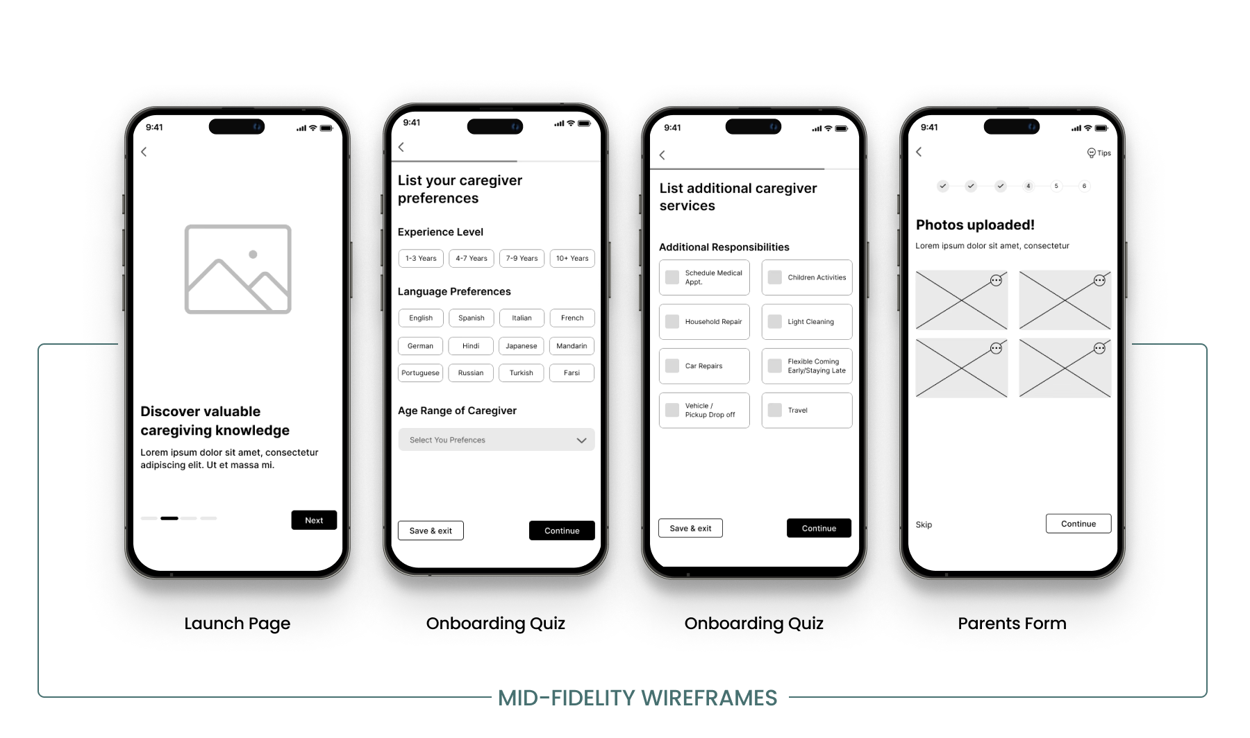
As a team, our goal was to create digital screens that are easy to navigate, with a particular focus on designing a streamlined onboarding tour and intuitive selection process. We prioritized delivering a user-friendly mobile app that enhances the user experience without overwhelming users.
Click here to explore all mid-fidelity wireframes
Mid-Fidelity Usability Test and Insights
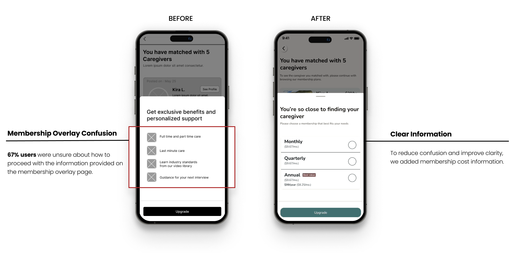
Before moving to the high-fidelity prototype, we conducted 3 usability tests with parents. The primary reason for doing this at this stage was to quickly identify and understand users needed to improve usability, allowing us to redesign and save time.
Key points we wanted to observe during user testing:
Ease of Navigation: Ensure users can navigate the application easily and effectively.
Onboarding Experience: Aimed to ask key questions to match users with the best caregiver while keeping the process simple and stress-free.
Smooth Membership Process: Verify that the membership process is smooth and without difficulties.
Task: Users were moderated to discover the platform to create a job listing for hiring a caregiver, selecting multiple criteria based on personal preferences. Once the caregiver list was generated, describe the next steps to take.
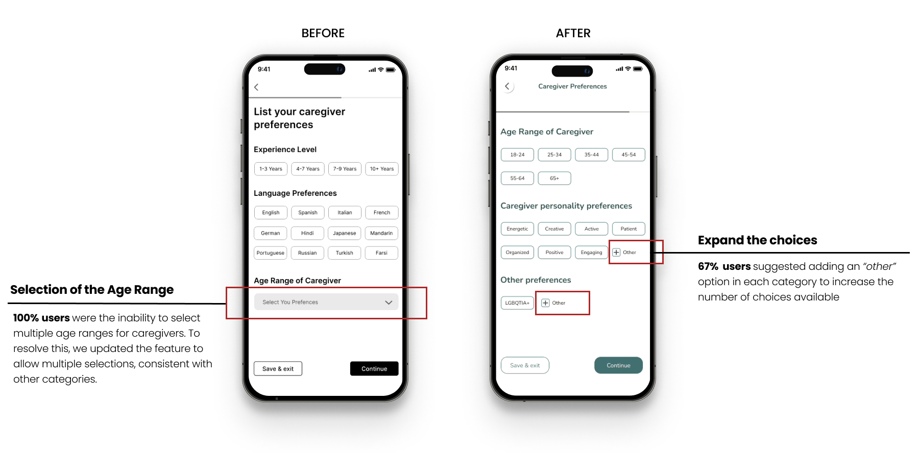
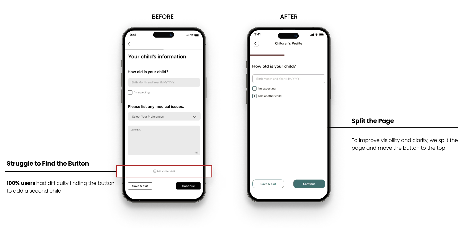
Caregiver Matching Screen
Membership Overlay Screen
Caregiver Preference Screen
Children Profile Screen
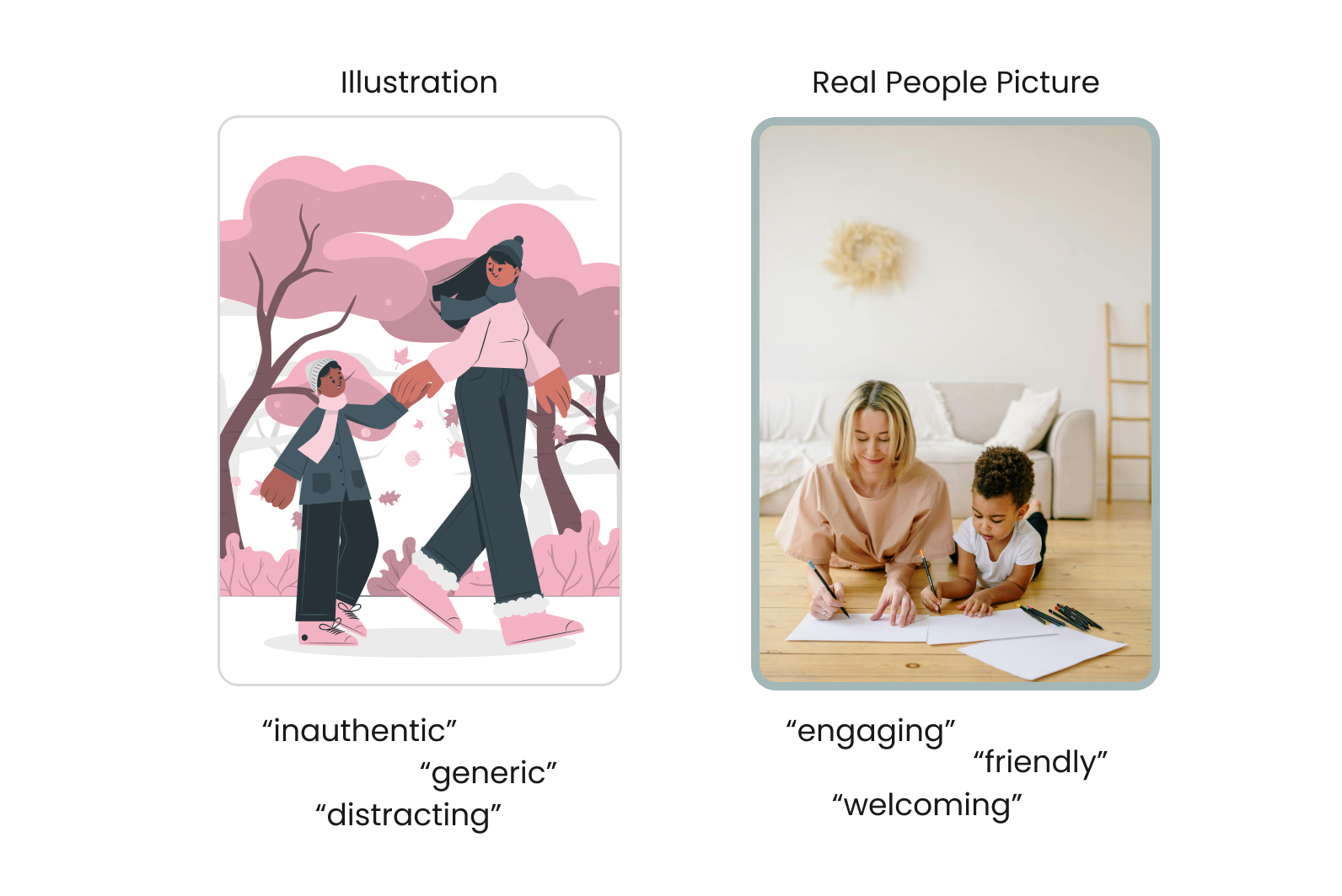
Visual Preferences: A/B Testing Illustration vs. Real People Image
We conducted A/B testing before moving to the high-fidelity prototype because our team had not yet decided whether to use real photos or illustrations in our design. As the research lead for the project, I guided the A/B testing to determine which visual users found more trustworthy and which they preferred. In the test, we asked 10 parents to indicate which words each image inspired for them. The results showed that real photos were described as "engaging" and "friendly" while illustrations were perceived as "distracting" and "inauthentic." Based on the A/B testing results, we decided to use real photos and confirmed this decision with the client to ensure alignment.
Illustration and Real People Image from A/B Testing
Crafting the Visual Identity: Design System
To ensure the color palette was welcoming, safe, and aligned with accessibility standards, our design team selected natural and soft tones. This choice ensured that the visual theme felt both welcoming and consistent with the brand's identity.
Primary Color: Used for the background of the app, slide indicator, and highlight features
Secondary Color: Used for buttons, and cards
Tertiary Color: Used for calendar, topbar, and slide indicator
The mood board was created by me during the brainstorming session. Click here to explore all the color work
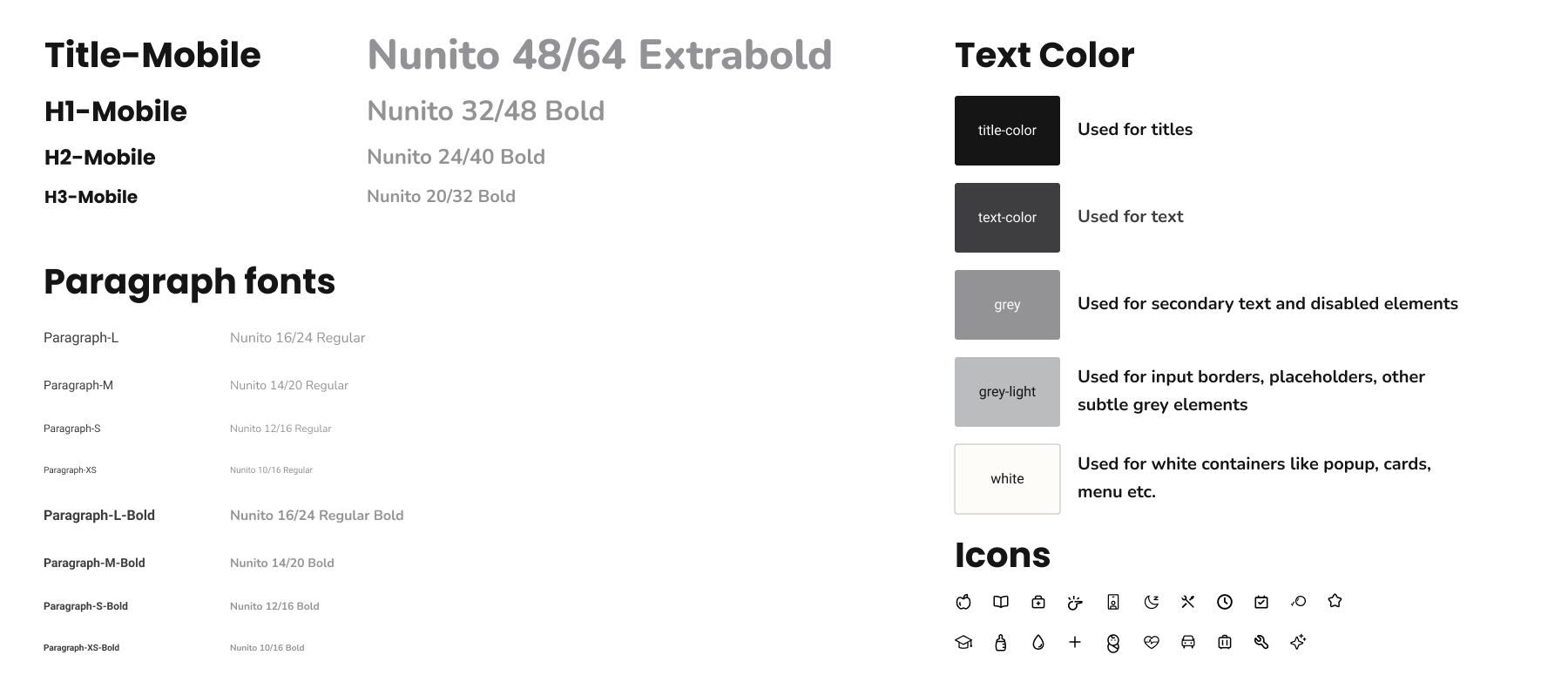
For typography, we chose a rounded typeface to create a welcoming, readable, and modern experience. To complement this, we selected icons from Figma plugin resources that align with the same aesthetic principles, reinforcing our overall design approach.
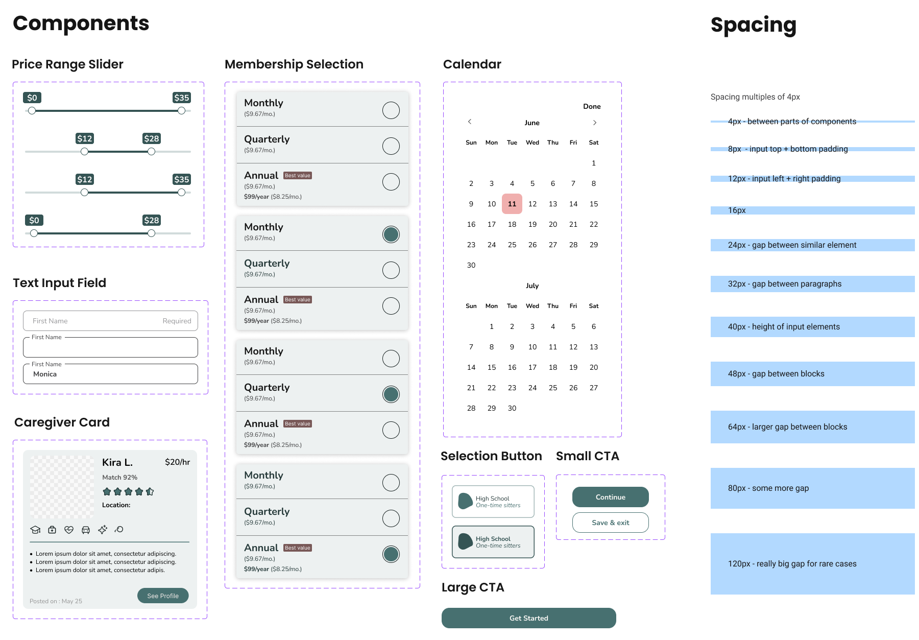
Our design system focused on creating a user-friendly and trustworthy. The color palette was selected to align with business goals and user expectations, focusing on trust and kindness. Natural and soft tones were used to create a welcoming, safe, and accessible experience. We chose the rounded typeface Nunito for its soft and playful qualities, reflecting children's behavior and ensuring a welcoming and modern design. We designed several components for the project to ensure consistency. A spacing legend was created to maintain consistent spacing between elements, ensuring a cohesive and readable user interface.
Final Product Showcase: Hi-Fidelity Mobile Mockups
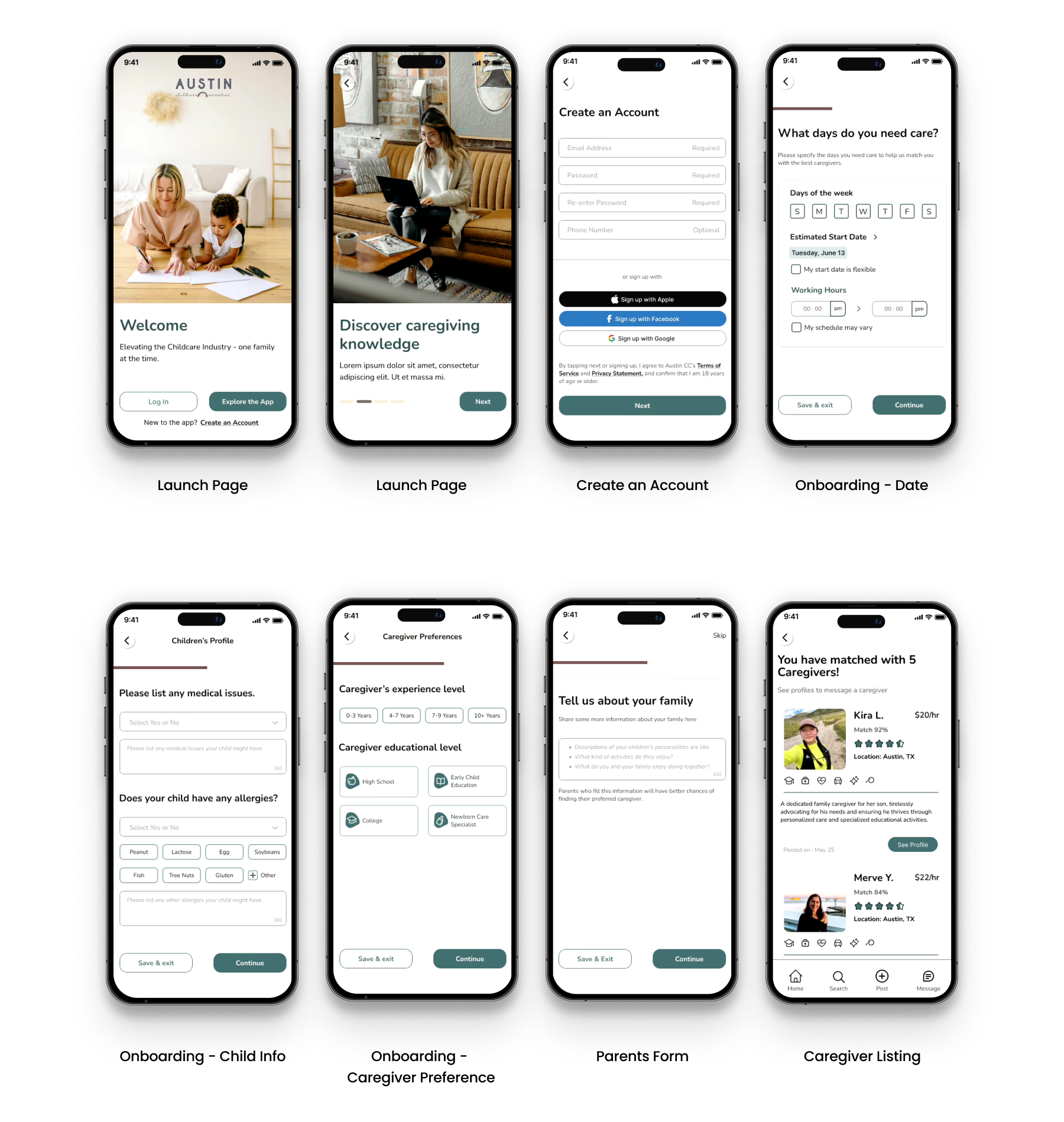
We delivered 25 high-fidelity mobile mockup screens to our client, covering key screens such as the launch screen, onboarding questions, parent forms, and caregiver listings.
Hi-Fidelity Mockup screens. Click here to discover the user flow prototype
Next Steps
Create Individual Child Profiles: Develop features that allow parents to create and share individual profiles for each child with caregivers when needed.
Implement Background Checks: Introduce background check functionality for both caregivers and parents to ensure safety and trust within the platform.
Develop a Comprehensive Homepage: Design a homepage that provides users with easy access to their profiles, job postings, and educational materials to support caregivers in their careers.
Refine Hi-Fidelity Designs: Reiterate and refine high-fidelity designs to ensure alignment with the iOS design system and enhance overall usability.
Testimonials
“I highly recommend Merve for her exceptional work on our most recent UX project. Her expertise in user research was invaluable, providing deep insights that shaped our design decisions. She conducted thorough user interviews and effectively synthesized the feedback into actionable improvements. Her strong analytical skills and attention to detail ensured our project met user needs. She will undoubtedly make a significant impact on any team she joins.”
— Rachel Wardlaw | Digital Product Design Leader
“Merve brought clarity to the Austin Childcare Connection project with her ability to stage research for quick results. Whenever we encountered a question, she would be quietly in the background, putting the pieces together so we could get the information we needed to make an informed decision. She worked tirelessly to ensure we had all the information to make informed decisions. She also designed a questionnaire flow that followed the research precisely and made the prototype ready for easy navigation. Bring her to your team if you want a good team member to collaborate with and take your team to the next.”
— Hannah Moore | UX Desinger
Thank you!
Thank you for reviewing my case study. For any questions or further discussion, please contact me at yasavur.merve@gmail.com. I look forward to hearing from you!
