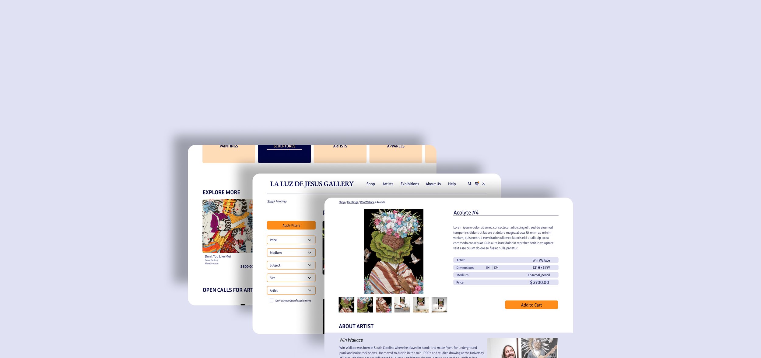
This conceptual project focused on redesigning an art gallery's website that showcases pop-surrealist artwork, known for its bright colors and intricate forms. The challenge was to create a design that complements the vibrant art without overshadowing it, balancing the website’s aesthetics with the artwork to enhance the user experience.
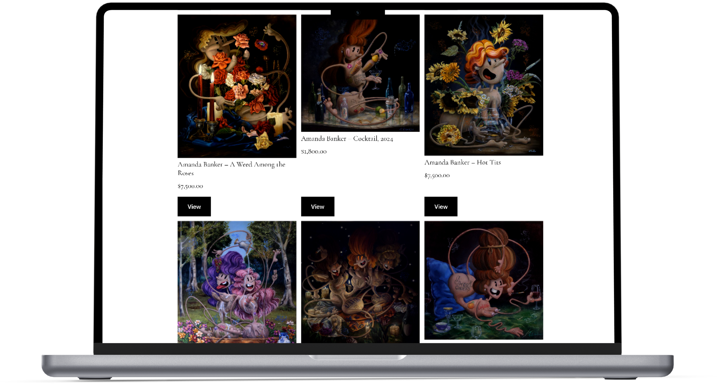
Current La Luz de Jesus Art Gallery Website Product Listing Page
Time
3 Weeks
Project
Conceptual Project
Redesigning for Artistic Harmony
Role
Solo UX | UI Designer
Tools
Figma, Canva
Understanding User Shopping Habits and Cultural Perspective
Conducted 4 user interviews with individuals born and raised outside the United States, and currently residing in the country. Interviews aimed to understand shopping habits, needs, and frustrations. These points are important for users:
Unfamiliarity with US-based measurement system
Trusting the website
Easy return process
Finding the item based on their criteria
Suggestions and details of the product
** Quotes from User Interviews
Identified Pain Points of the Website
I conducted a usability test during user interviews to better understand the current website. I assigned each user a predefined task. Common challenges and pain points identified during this test were:
Difficulty navigating the unstructured website
Lack of filtering or search options
Absent product details
User Task: Find artwork from Christopher Bales and check out in 60 seconds on the current website
A Closer Look: Analyzing Competitors
Through comparative and competitive analyses, I identified several features that competitor websites offer but are absent on the gallery’s website.
Filters for product specifications
Guest checkout option for ease of use
Product previews
Similar product suggestions
Comprehensive product details
Persona Insight: Haruki’s Measurement Dilemma
After conducting user interviews and usability tests on the current website, I identified key pain points and user needs. This research led to the creation of the persona "Haruki," a Japanese user struggling with selecting an anniversary gift within a budget and understanding product sizes due to unfamiliarity with the US measurement system.
Haruki, originally from Tokyo Japan, wants to select a meaningful anniversary gift for his wife for their anniversary within a budget. However, one of his challenges is understanding whether the artwork will fit in their home because he’s not familiar with US customary units like inches and feet.
Cross-Cultural Adaptation: Enhancing Website Navigation
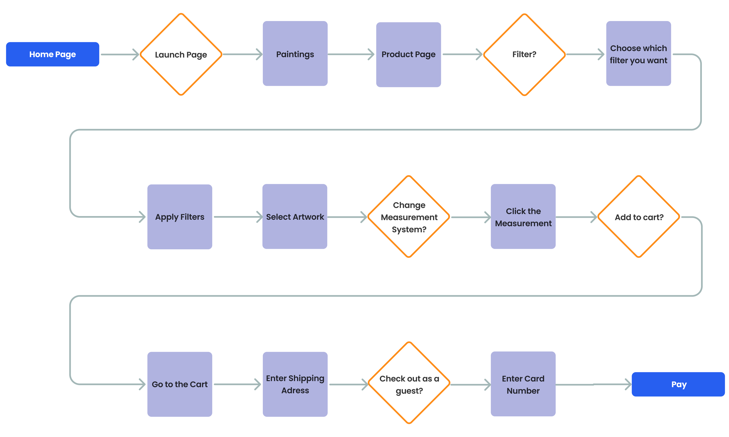
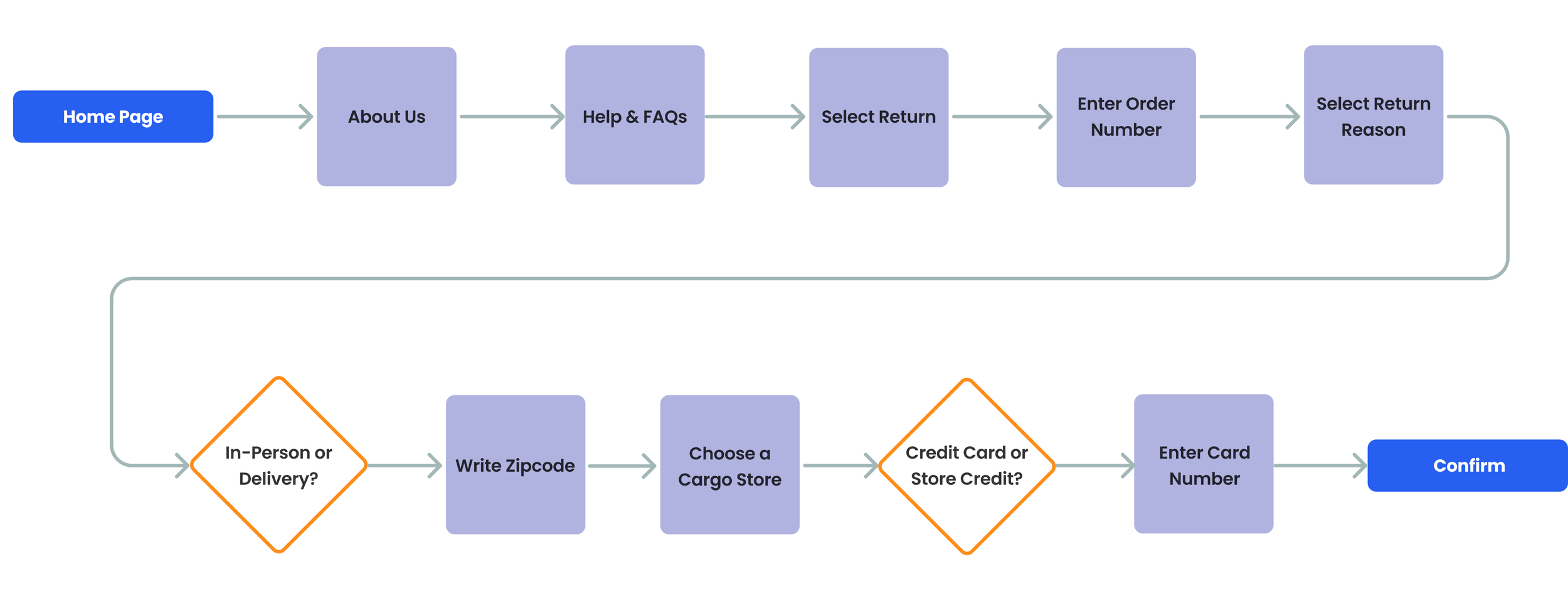
For this project, two user flows were developed based on user interviews. The first flow involves users shopping for products within a specific category, while the second one includes the process of returning purchased items without the need to create an account.
User Flow-1: This User flow is designed for users who know which category to shop in when visiting the website.
User Flow-2: This user flow is for a customer who wants to return items.
Design Ideation: Balancing Aesthetics and Functionality
After completing all the research, it's time to dive into the design phase. To address the existing pain points on the current website while also incorporating user needs and competitor features into a cohesive synthesis.
Key Design Enhancements for Improved User Experience
To ensure inclusivity and ease of use for users from diverse backgrounds, several key adjustments were made:
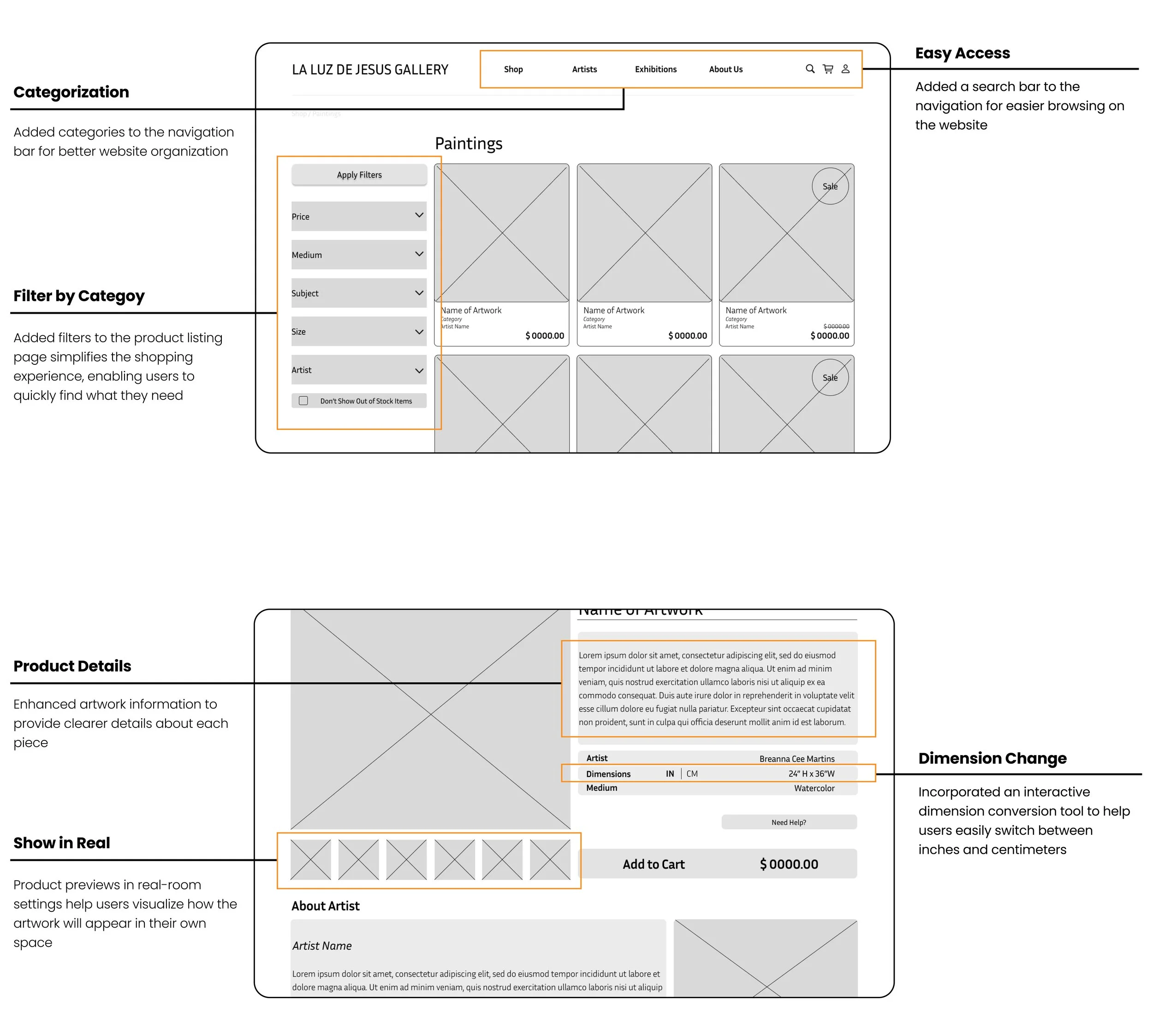
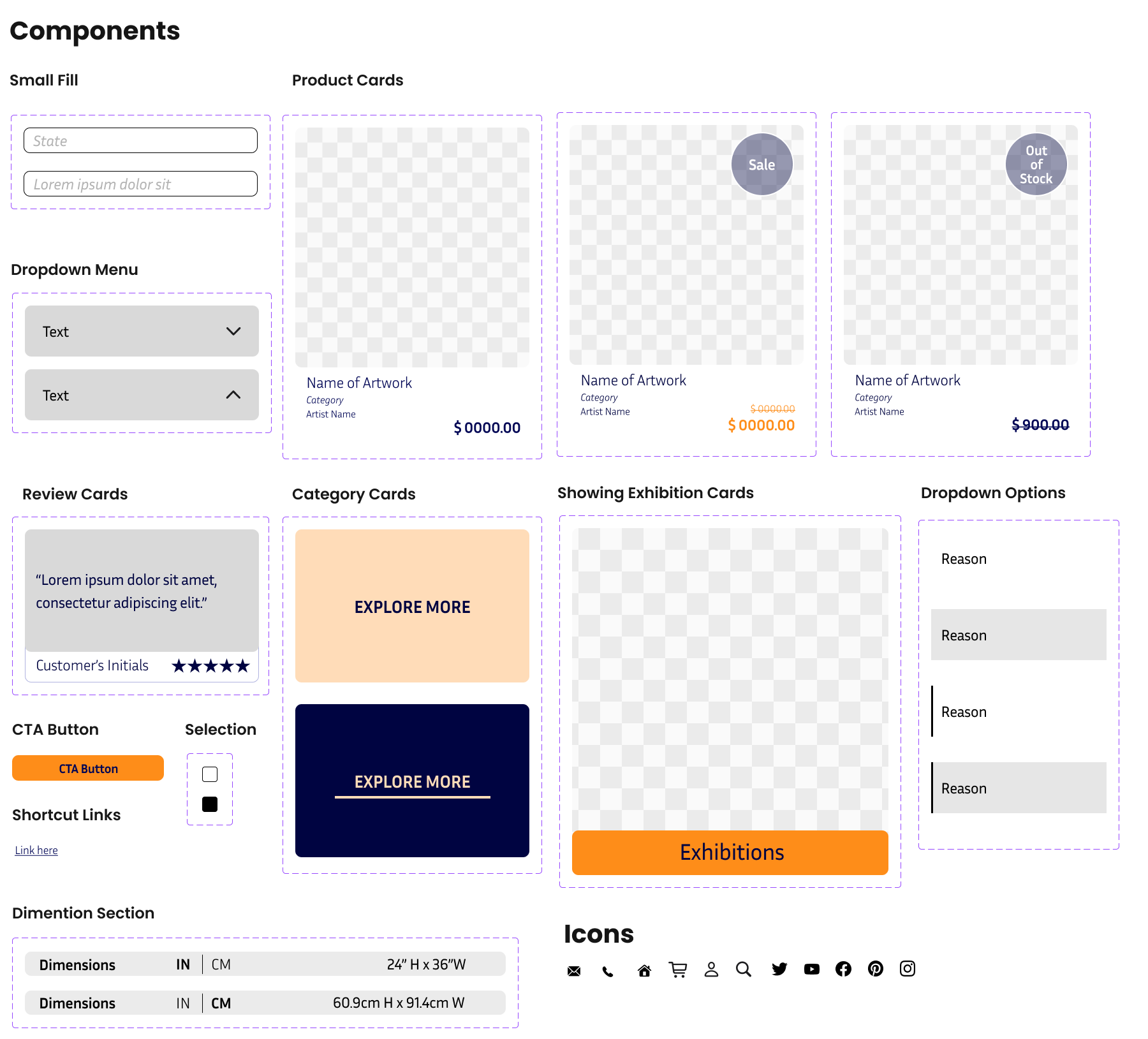
Measurement Conversion: Implemented a feature in the product details section that allows users to convert measurements from inches to centimeters.
Improved Categorization: Added additional categories within the homepage and header to better organize product offerings.
Enhanced Accessibility: Designed a product listing page with a filter feature and added a search bar on the header for easier navigation and access.
Iterative Improvements Based on Usability Testing
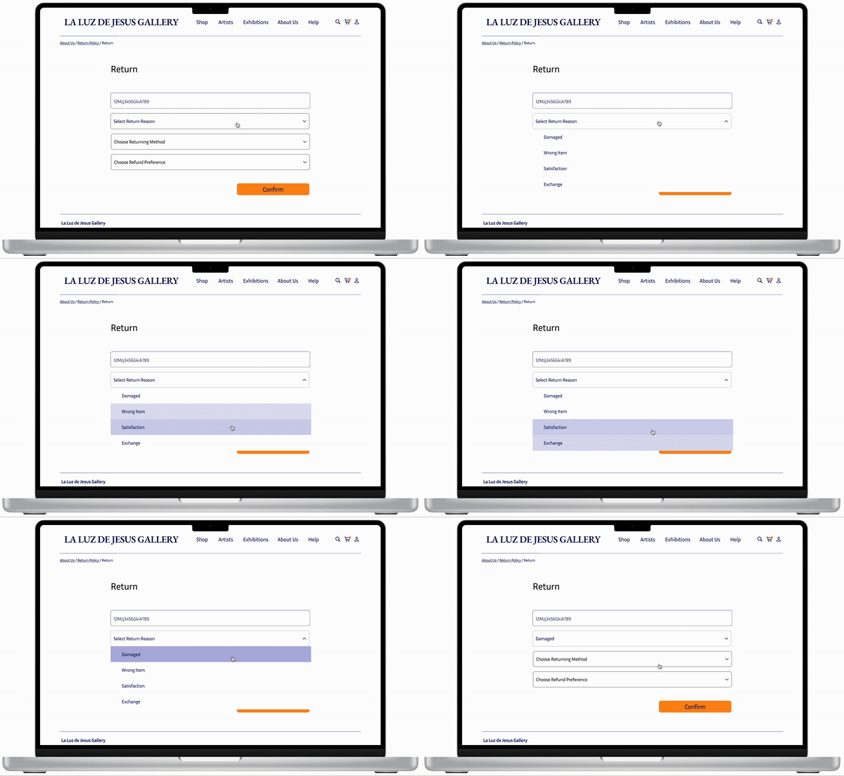
Following usability tests on the mid-fidelity prototype, although all users successfully completed the task of purchasing a watercolor painting, they encountered several pain points when attempting to return the item. To address these issues, several iterations were made to create a more user-friendly and accessible website interface. The user experience:
Enhanced Navigation: Adjusted the size of categories on the navigation bar for better visibility and easier navigation.
Clear Call-to-Actions: Separated the call-to-action button from the price to prevent user confusion.
Accessibility Improvements: Modified the breadcrumbs' typeface color to ensure better visibility and identification.
Streamlined Access: Added shortcuts to policy links in the footer for easier access.
Visual Clarity: Incorporated icons in the footer to enhance clarity.
Harmonize the Design Palette with the Artwork
The main design challenge was ensuring the website design complemented the vibrant, pop-surrealist art without overshadowing it. The artwork features bright colors like shiny pink, purple, orange, blue, and green, as well as dynamic figures. I selected colors directly from the artwork to harmonize the UI with the art.
Orange, symbolizing energy and action, was used for call-to-action buttons.
Light blue, representing trust and reliability, was utilized in all informational sections.
This approach maintained the visual impact of the art while creating a cohesive and engaging user experience.
** Moodboard is a combination of Pop-Surrealist Artwork
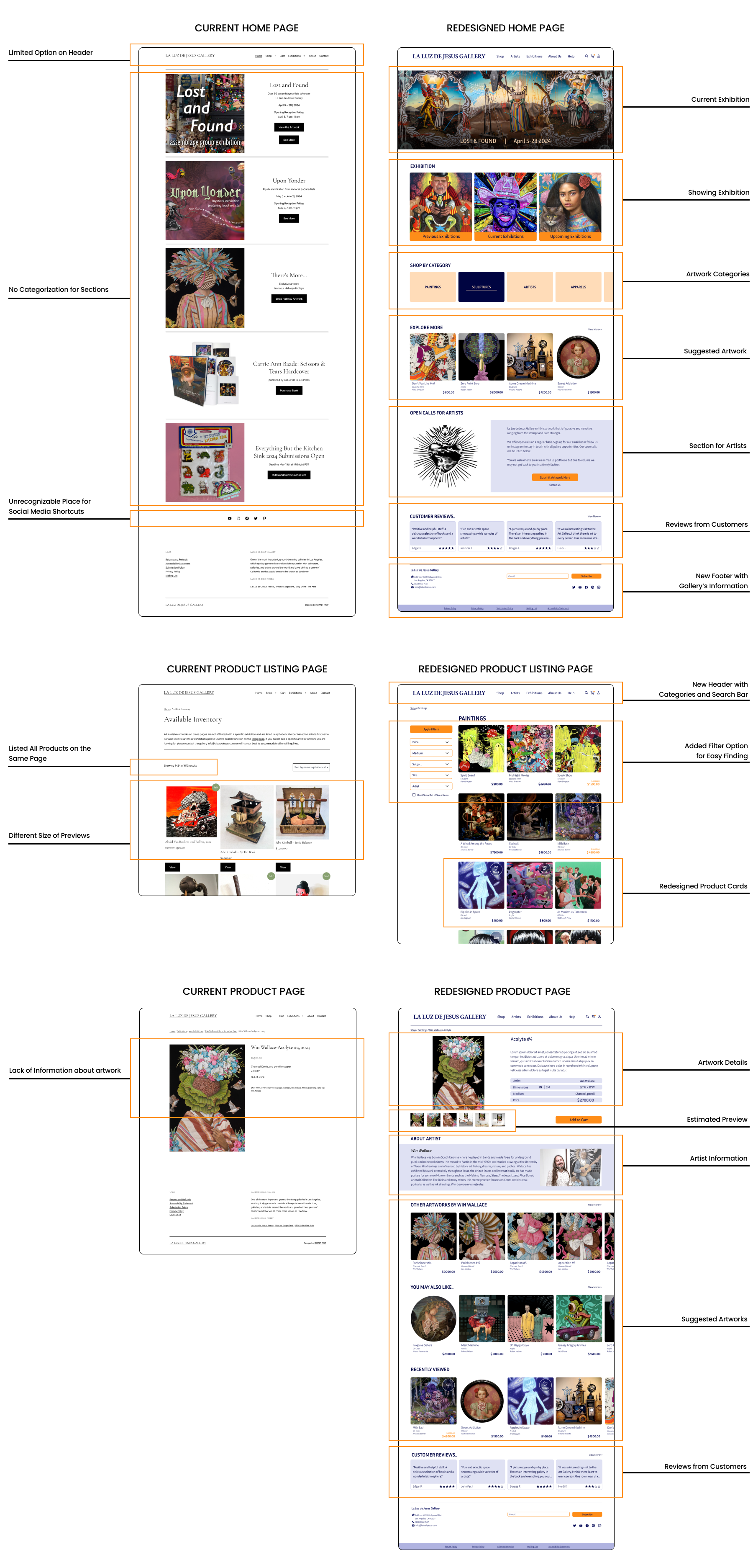
Comparison of Current and Redesigned La Luz de Jesus
Considering the shortcomings of the current website and users' online shopping needs, the redesigned website offers significant enhancements. The comparison between the existing and new websites is as follows:
Returning Process Prototype Details
Key Takeaways and Insights from the Project
Balancing Aesthetics and Functionality: Ensured that the website design complements the vibrant pop-surrealist artwork without overshadowing it, highlighting the importance of harmonizing aesthetics with product presentation.
User-Centric Design: Identified the need to address users' specific challenges, such as understanding measurement systems and finding products easily, which reinforced the value of a user-centered approach.
Importance of Clear Navigation: Emphasized the necessity for intuitive navigation and clear categorization to improve user experience and accessibility.
Iterative Design Process: Gained insights into the benefits of iterative testing and refinement, particularly in addressing usability issues and enhancing overall design effectiveness.
Effective Prototyping: Learned the value of prototyping new features, such as filter sections, to ensure they meet user needs and improve functionality.
Thank you!
Thank you for reviewing my case study. For any questions or further discussion, please contact me at yasavur.merve@gmail.com. I look forward to hearing from you!
