Project Overview: Leveraging Data to Enhance User Engagement in Shazam
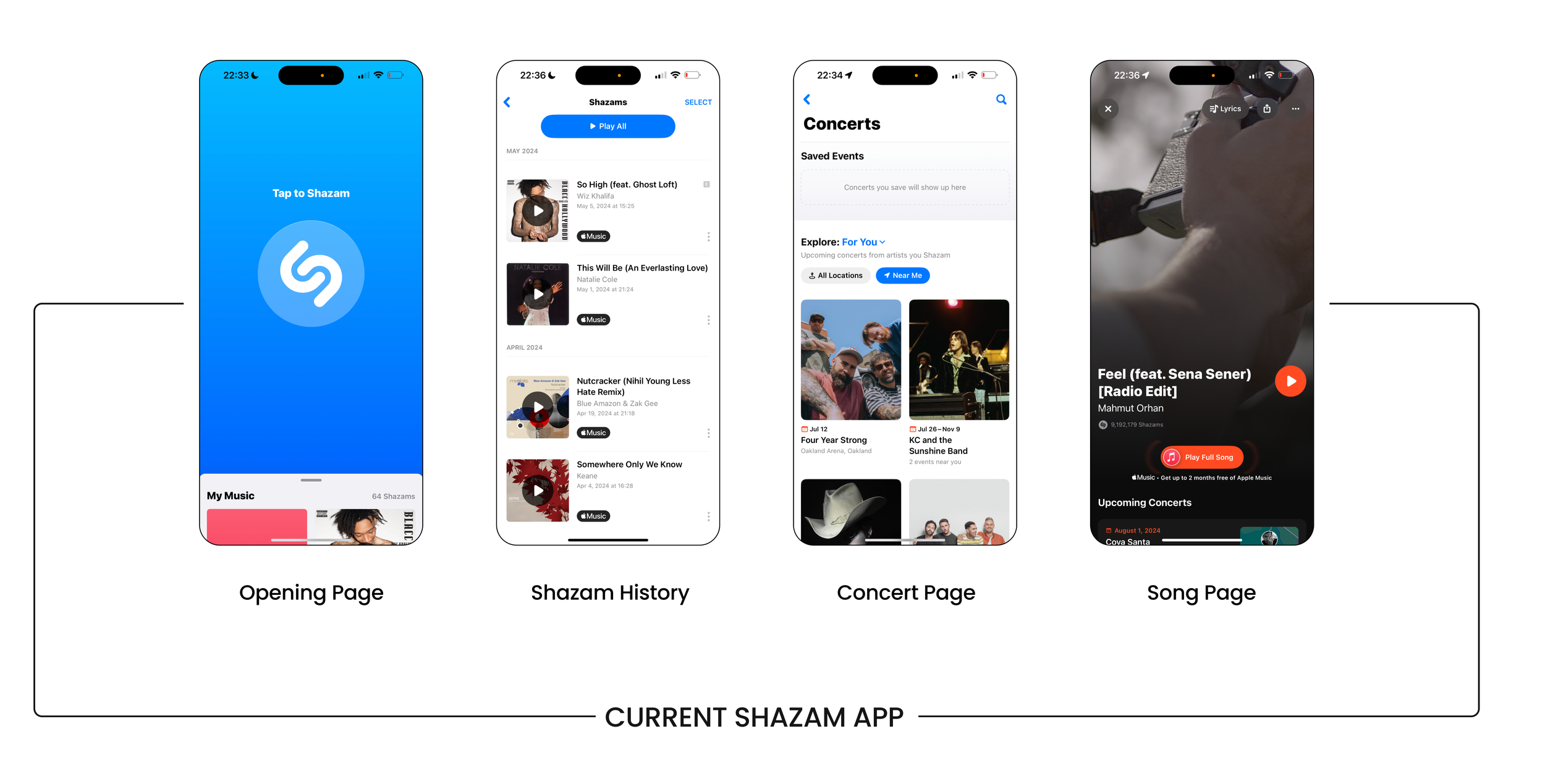
Shazam, renowned for its ability to identify song titles and artists within seconds, has evolved into a platform for discovering new music, following artists, and exporting songs to other music platforms. However, users typically spend less than 30 seconds on the app, indicating a missed opportunity to enhance engagement.
Also, the project considerations are:
Geological Data
Collecting Music
Music Recommendations
Social Networking
Time
2 Weeks
Role
UX Designer | Project Manager
Tools
Figma, Canva, Asana, ChatGPT
Project
Conceptual Team Project
Understanding Business Goals
Analyzing Shazam's business goals, we discovered Shazam functions not just as a music identification app but also as an intermediary platform that directs users to music services. Based on our business analysis, we observed four main goals:
Affiliate Partnership
Music Promotion
Revenue from ad impressions and clicks
Sell the predictive analysis to concert promoters to make decisions about tour locations
User Interviews: Insights into Music Discovery and Engagement
To gather insights, we interviewed 6 frequent music app and Shazam users. Based on our interviews, we identified four main user needs:
Discovering new songs
Accessing song history
Receiving recommendations for similar artists and songs
Sharing music with friends
** Quotes from User Interviews
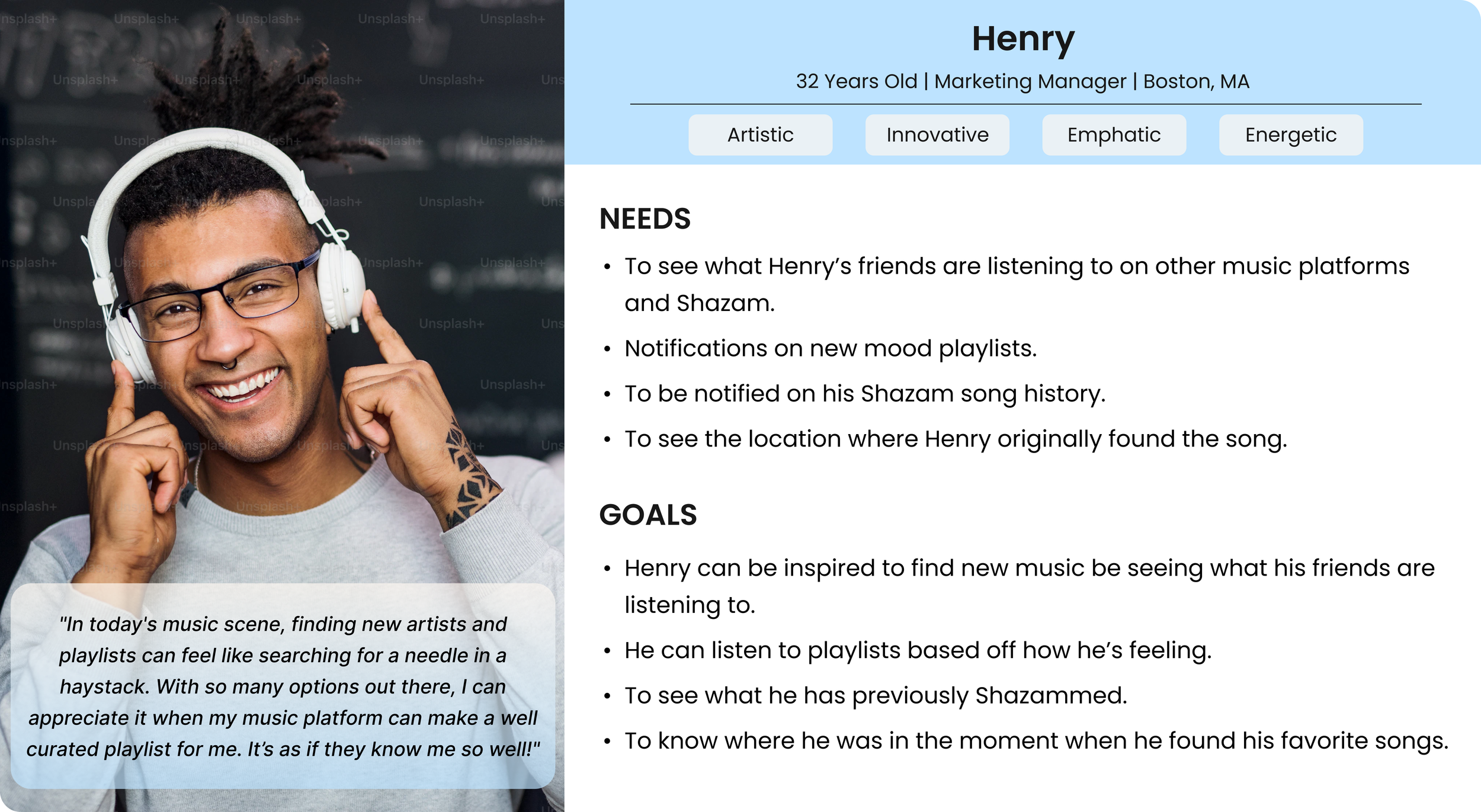
Meet with Henry: The Persona
Henry is disinterested in his current music taste and needs a way to discover new music and be able to share his findings with his friends without switching between multiple apps.
Creating Design Solutions for Pain Points
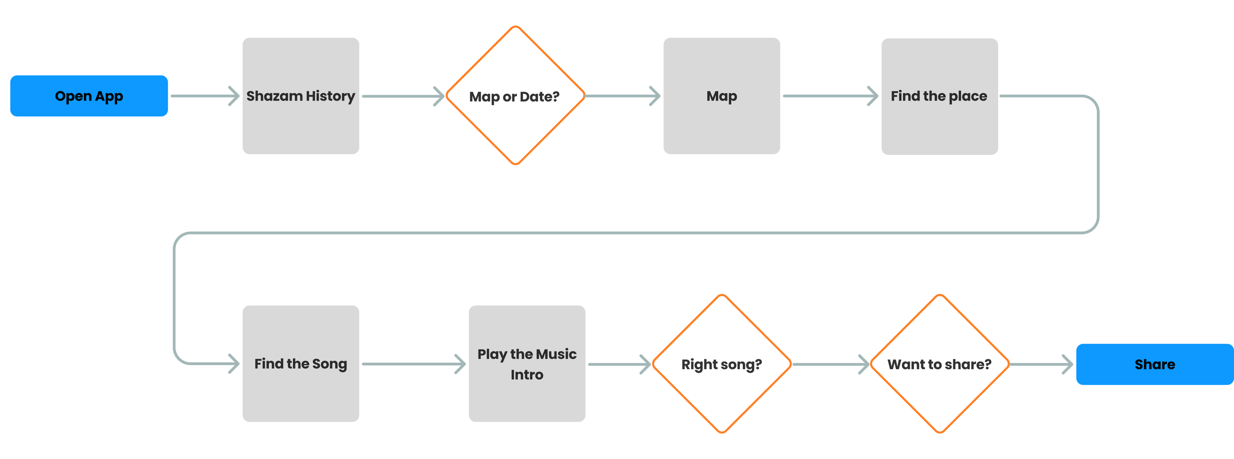
We developed two user flows for our persona, focusing primarily on the first flow to help users easily find their previous discoveries. Users often experience frustration when trying to remember songs they previously discovered. To address this, the app now saves users' Shazams and displays them on a map, making it easier and more interactive to locate past discoveries. I collaborated closely with the team on another user flow, providing feedback and designing all components and cards, including those for songs, concerts, and Shazam history.
Happy Path of the User Flow-2. Click here to explore extended user flow and User Flow-2
User Goal: Henry tried to find a song he had previously Shazamed in North End, Boston. After he finds it, he needs to make sure it is right and share it with his friend, Emilio.
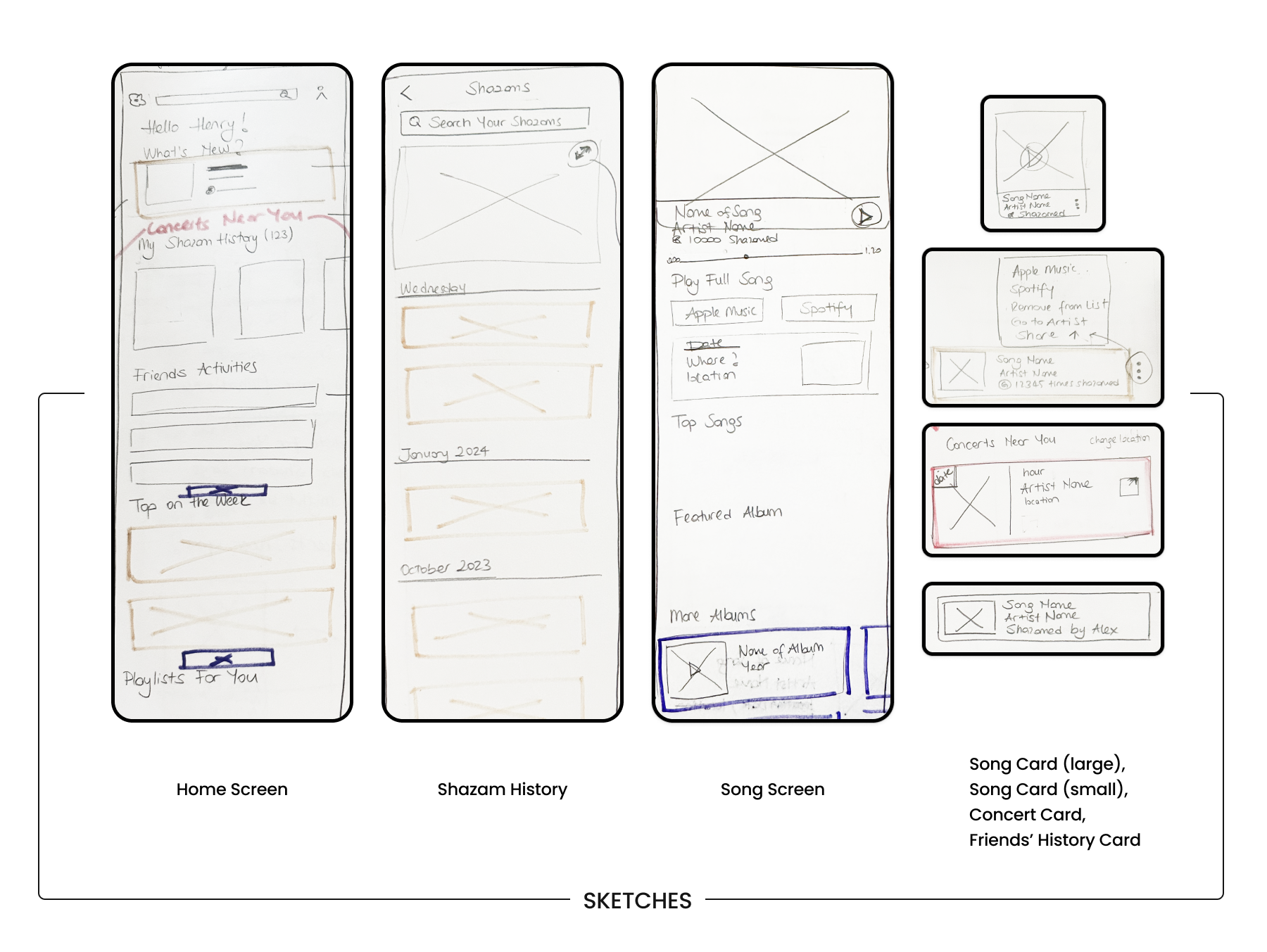
Sketching the User Journey
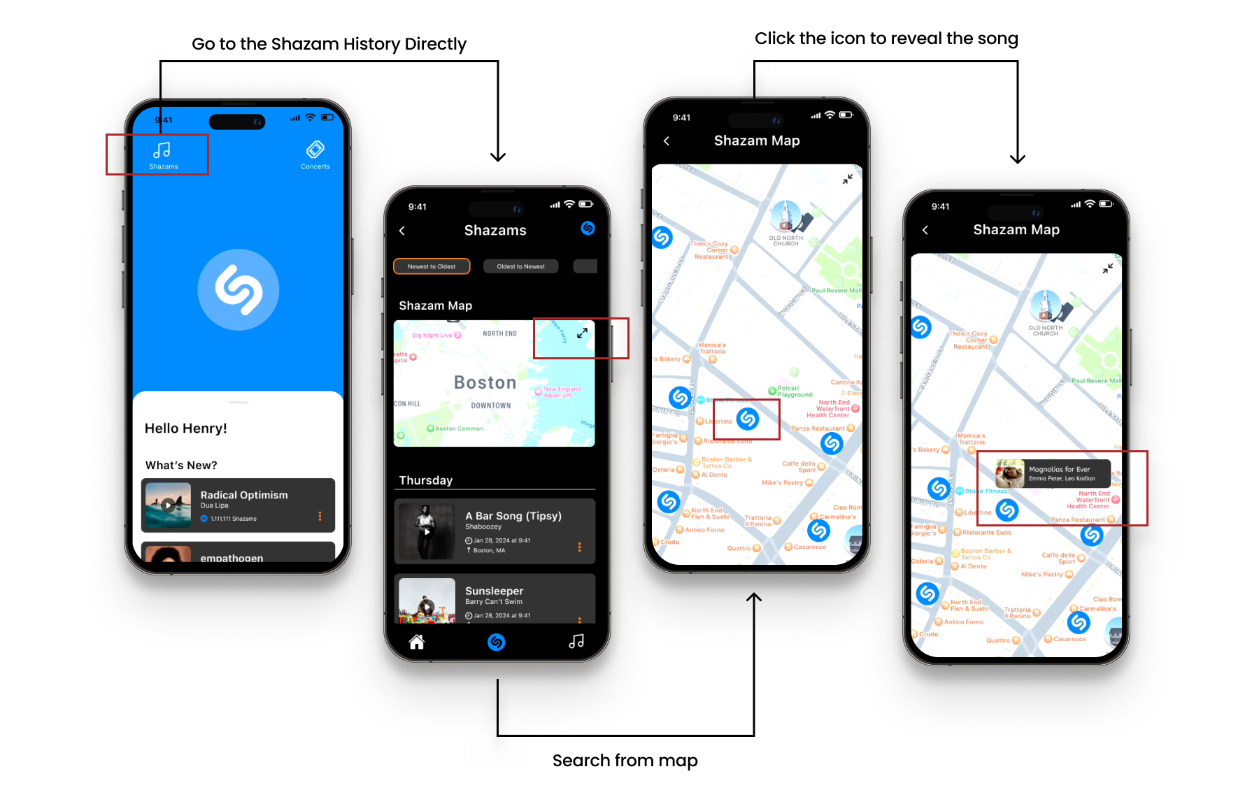
Elevate user engagement with an interactive song history feature, allowing users to easily explore their Shazam history. By enabling searches based on date or location through an intuitive map interface, the experience interaction within the app enriches users' musical journeys.
The screens were designed by me during design studio time
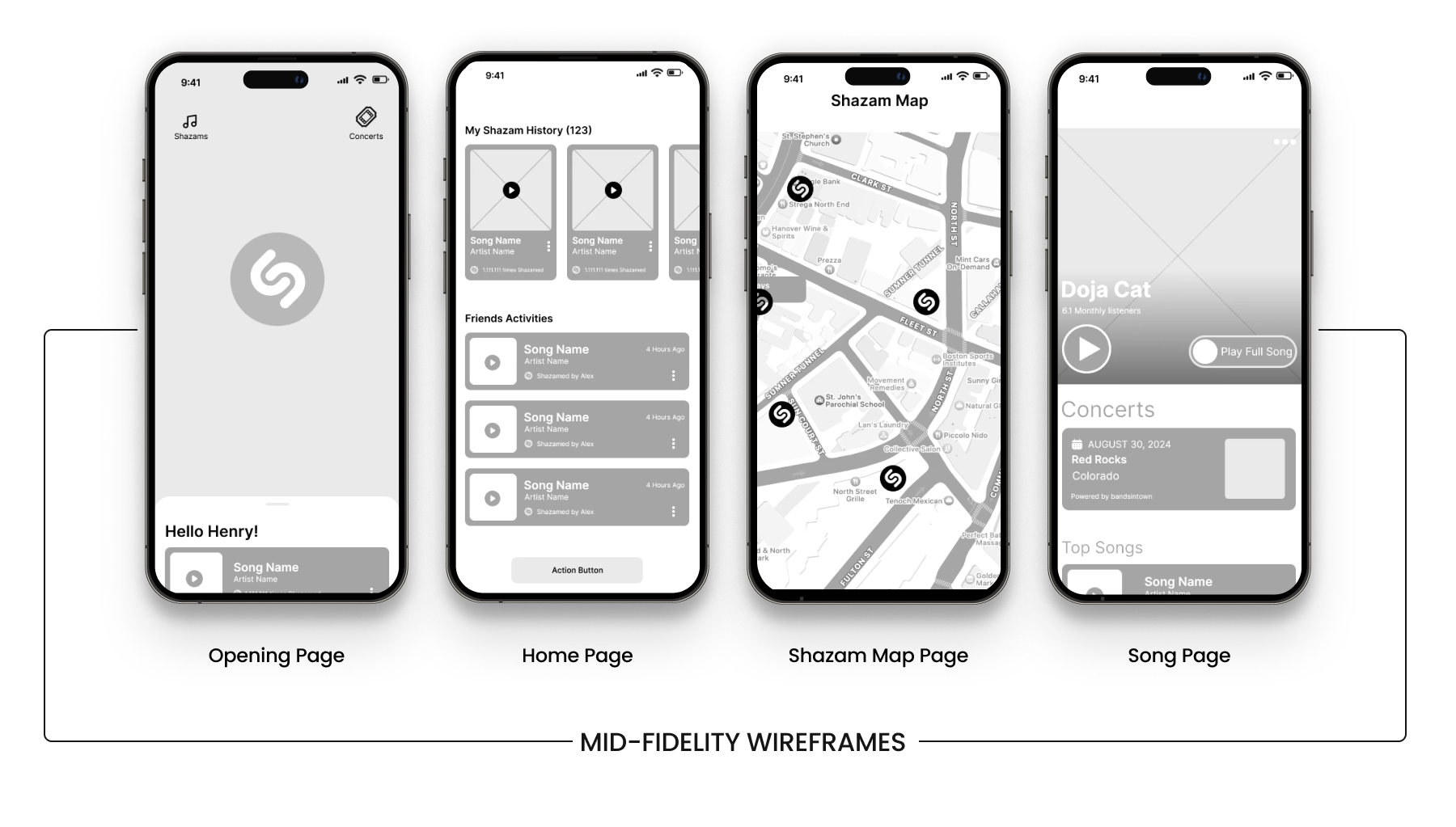
Wireframes: Structuring the User Experience
Through extensive brainstorming and user feedback, we strategically refined the existing Shazam app features while introducing new functionalities to enhance user interaction. The wireframes incorporate these improvements, allowing users to seamlessly view friends' activities, search Shazam history by date or alphabetically, and explore past discoveries through an interactive map. These enhancements were designed to create a more engaging and intuitive user experience, aligning with our research insights.
Usability Testing and Iterations
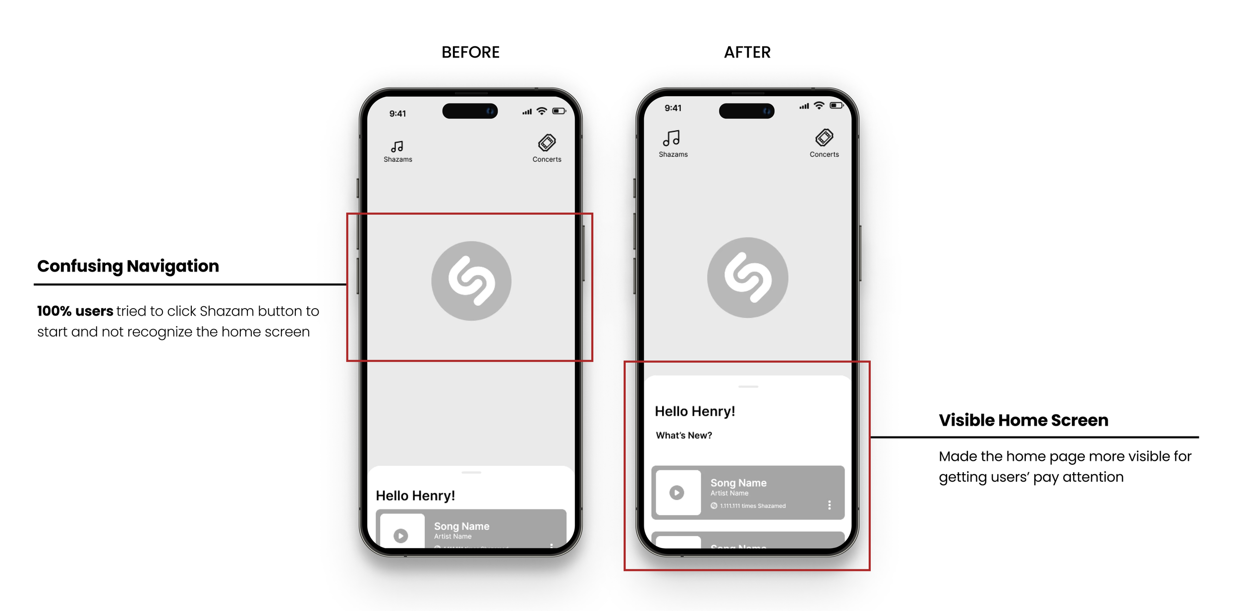
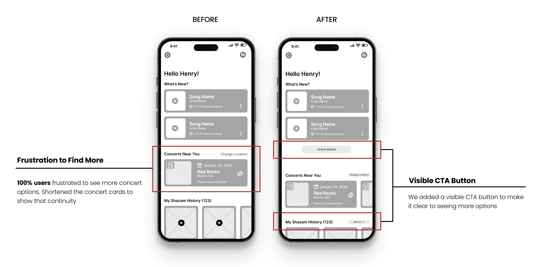
We conducted usability tests to understand users’ pain points on our design. Key findings included:
Users clicked the Shazam icon to navigate, bypassing the home page on the landing page.
Missing the CTA button on the home page is confusing during users need to navigate to other pages.
Shazam Opening Page
Shazam Home Page
Detailed Interface Design: Design Decisions and Components
Color Palette: We chose a sophisticated color scheme with variations of black as the primary color, orange as the secondary, and Shazam's signature blue as the tertiary color.
Dark Mode Layout: A primarily dark mode layout was selected to enhance readability and give the app a sleek, modern look.
Consistent Song Cards: Music content was organized into song cards to maintain tight and consistent elements, utilizing the law of proximity for a clean and cohesive design.
Typeface Selection: SF Pro was chosen as the typeface to align with Apple's ownership of Shazam, ensuring brand consistency.
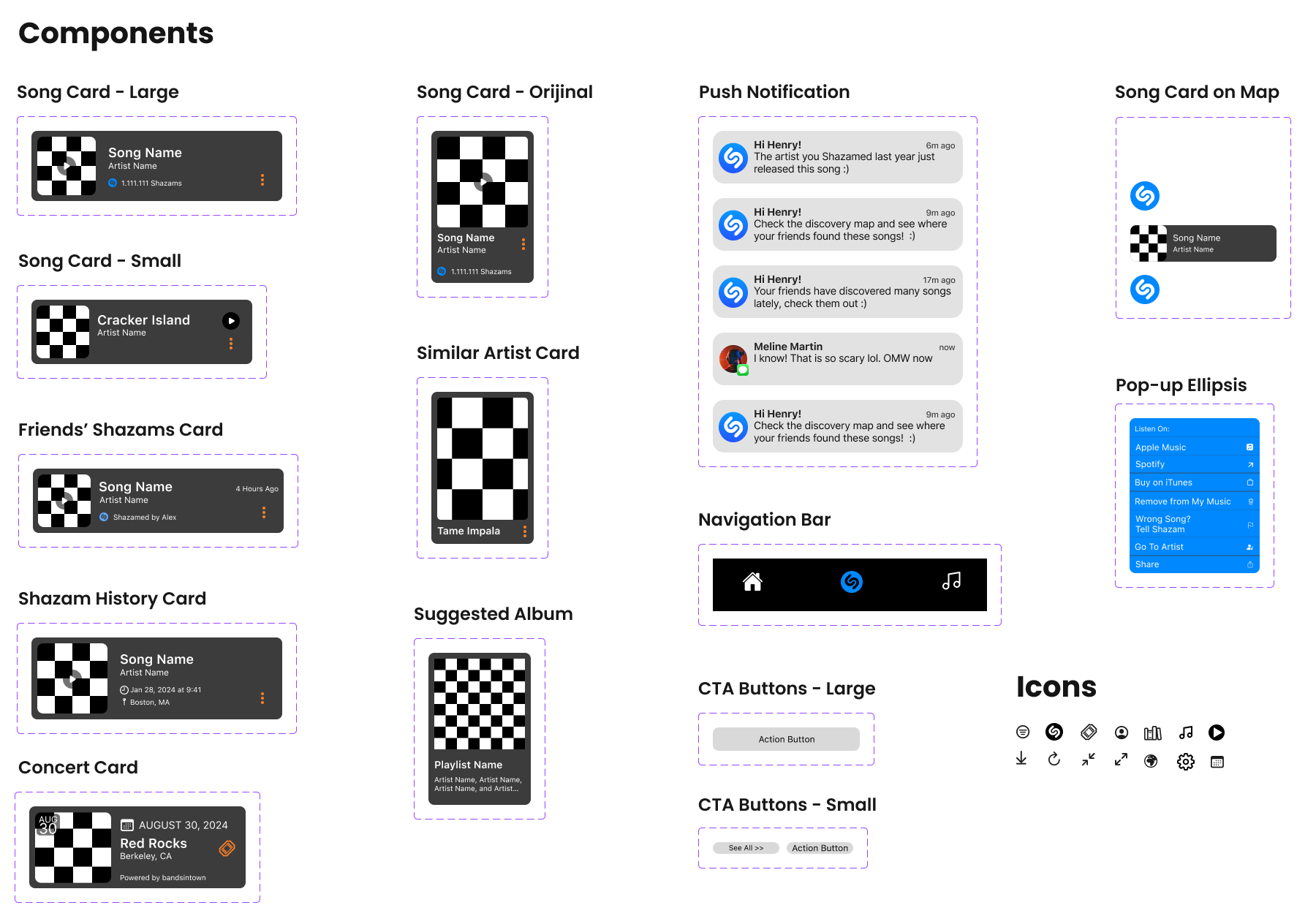
While I was designing the components, I influenced by Shazam and Spotify cards
Bringing the Design to Life: High-Fidelity Mockups
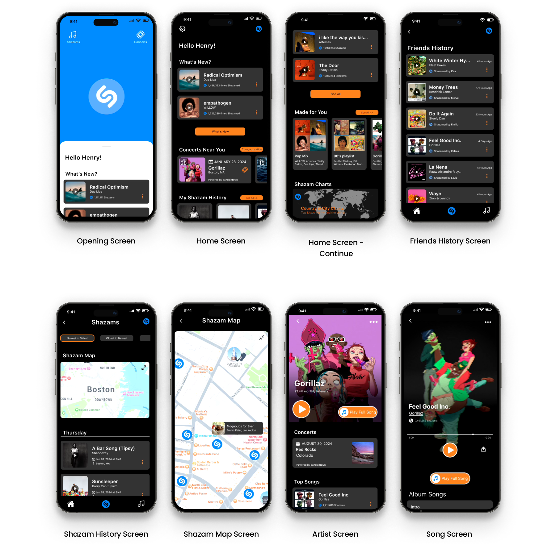
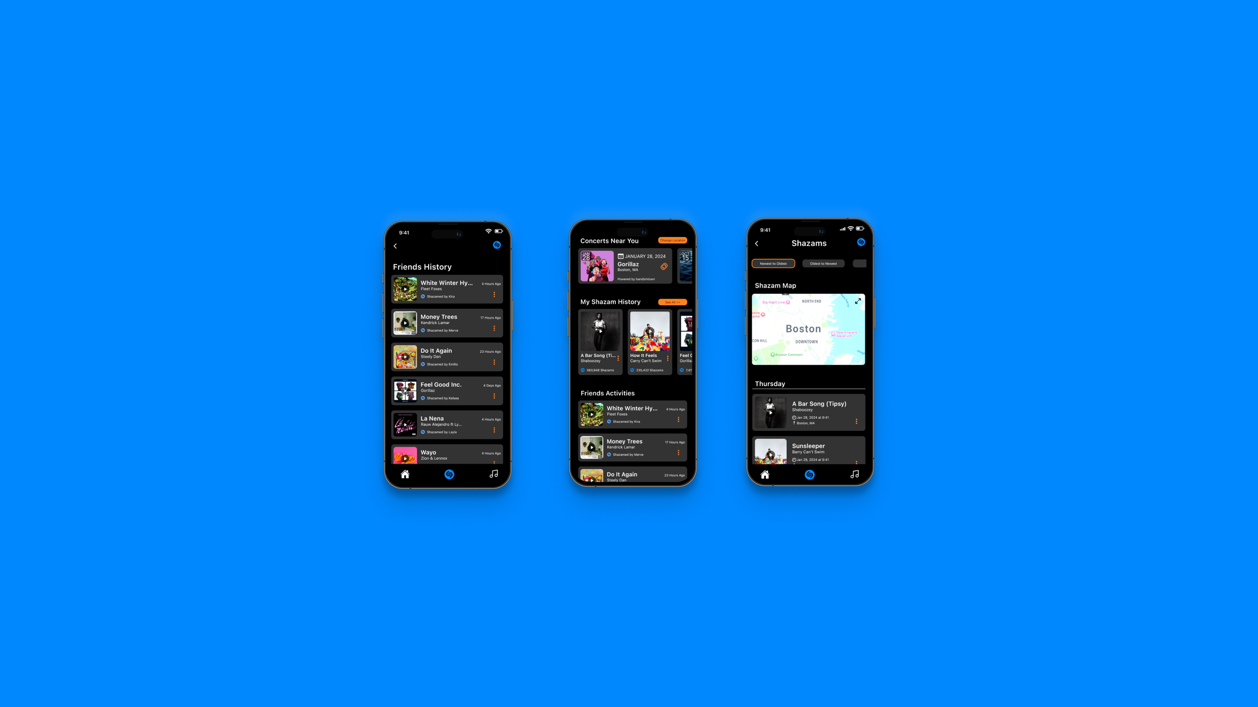
These mockups integrate the refined user flows, enhanced features, and user-focused design principles we developed, providing a polished preview of the app’s functionality. This phase emphasizes our dedication to addressing both business needs and user preferences, delivering a more engaging and visually appealing experience for Shazam users.
Hi-Fidelity Mockup screens. Click the links to follow User Flow-1 and User Flow-2 prototypes
Next Steps
Enhancing Privacy Options: Introduce features allowing users to manage their privacy when sharing music and locations with friends, ensuring a more secure and customizable experience.
Usability Testing for Play Button: Conduct a usability test on the high-fidelity prototype to determine if the "Play full song" button still causes confusion or frustration among users.
Usability Testing for Home Menu Navigation: Perform a usability test to assess user opinions on the transition from the music recognition screen to the home menu, ensuring a smooth and intuitive experience.
Boosting Engagement: Incorporate a social networking feature into Shazam's app to enhance user engagement, increase song discoveries, and improve retention rates.
Thank you!
Thank you for reviewing my case study. For any questions or further discussion, please contact me at yasavur.merve@gmail.com. I look forward to hearing from you!
